Golden Ratio – Designers guide on how to design with it. I really wanted to share this article and guide because it’s really good and I hope they never delete the original.
The Golden Ratio is a simple theory that can help make your designs pleasing on the eye. We explain how to use it.
There’s a common mathematical ratio found in nature that can be used to create pleasing, natural looking compositions in your design work. We call it the Golden Ratio, although it’s also known as the Golden Mean, The Golden Section, or the Greek letter Phi.
Based on the Fibonacci Sequence (which you may remember from either your school mathematics lessons or Dan Brown’s novel The Da Vinci Code), the Golden Ratio describes the relationship between two proportions.
Fibonacci numbers, like many elements found in nature, follow a 1:1.61 ratio – this is what we refer to as the Golden Ratio, and as it forms such a common sight in nature, it feels pleasing to the eye when we use this same ratio in our design work.
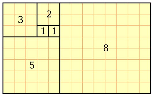
The Golden Ratio is the relationship between two numbers on the Fibonacci Sequence…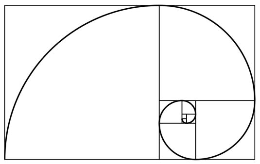
…and plotting the relationships in scale provides us with a spiral that can be seen in nature all around us
It’s believed that the Golden Ratio has been in use for at least 4,000 years in human art and design, but it may be even longer than that – some people argue that the Ancient Egyptians used the principle to build the pyramids. In more contemporary times, the Golden Ratio can be observed in music, art, and design all around you.
Examples of use
Use of the Golden Ratio is well documented in art and design throughout history, and can be seen in everything from architecture to the grand masters. By applying a similar working methodology you can bring the same design sensibilities to your own work. Here are just a couple of examples to inspire you:
The Parthenon
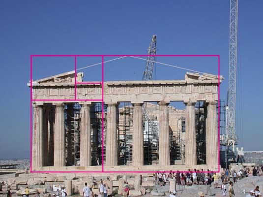
Ancient Greek architecture used the Golden Ratio to determine pleasing dimensional relationships between the width of a building and its height, the size of the portico and even the position of the columns supporting the structure. The final result is a building that feels entirely in proportion. The neo-classical architecure movement reused these principles too.
The Last Supper
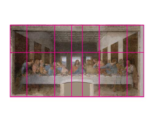
Leonardo da Vinci, like many other artists throughout the ages, made extensive use of the Golden Ratio to create pleasing compositions. In the last supper, the figures are arranged in the lower two thirds (the larger of the two parts of the Golden Ratio), and the position of Jesus is perfectly plotted by arranging golden rectangles across the canvas.
Examples in web design
2010 Twitter redesign
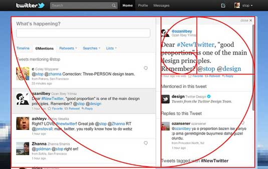
Twitter didn’t leave its 2010 redesign to chance
Twitter’s creative director Doug Bowman posted this screengrab on its Flickr page to explain how the company used the golden ratio in its 2010 redesign. “To anyone curious about #NewTwitter proportions, know that we didn’t leave those ratios to chance,” he teased.
Apple iCloud

The iCloud icon design wasn’t just a random sketch…
The design of Apple’s iCloud icon was firmly based on the mathematics of the Golden Ratio, as Takamasa Matsumoto explains in this blog post (original Japanese version here) and demonstrates in the annotated image shown below:
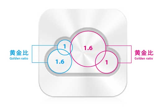
… but clearly based on the Golden Ratio
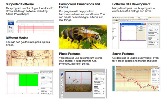
Golden Ratio tools
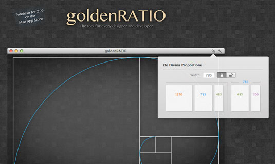
GoldenRATIO’s favourites feature stores your settings for repetitive tasks
GoldenRATIO is an app providing an easy way to design websites, interfaces and layouts according to the golden ratio. Available in the Mac App Store for $2.99, the app features a built-in calculator with visual feedback, a ‘favourites’ feature that stores you screen position and settings for repetitive tasks, and a ‘Click-thru’ mode which means you can use it as an overlay in Photoshop and still work on the canvas.
This calculator from Pearsonified helps you to create the perfect typography for your website in line with Golden Ratio principles. Just enter a font size, content width, or both into the field on the website, and click the Set my type! button. If you’d like to optimize for characters per line, you can enter an optional CPL value.
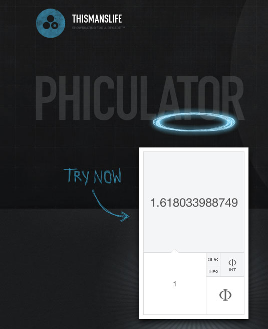
Phicalculator does one job, and it does it very well
This simple but useful free app is available for both Mac and PC. Give it any number and it will calculate the corresponding number according to the golden ratio.
Atrise’s tool lets you design visually according to the Golden Ratio
This on-screen ruler and grid software saves you all that messing about with calculations and allows you to design using the golden section proportion visually. You can see and change the harmonious forms and sizes, while being directly in the process of working on your project. A regular license costs $49, but you can download a free trial version that’s good for 30 days.
Source: Creativebloq.com


Recent Comments