Designing Faster with a Baseline Grid
4 Apr
source: teehanlax.com
Lately, grids have become the ultimate obsession of designers and design writers: hundreds — not to say thousands — of articles, tutorials, books and websites solely dedicated to grids and their application in (web)design have been published in the last few years. A simple search on Google with the terms “grid” and “webdesign” returns almost 5 million results. There is even a movie with characters trapped in what they call “the grid” […] “a final frontier”.
A short historical perspective
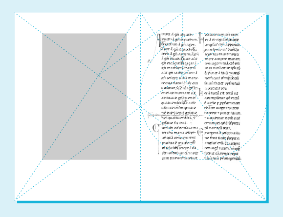
However, grids are nothing new and can be traced back to Middle Ages: in the 1220s/1240s, French architect Villard de Honnecourt designed construction canons based on geometry. These principles were later studied by typographers and designers in the beginning of the 20th century to reverse-engineer medieval canons of page construction. Among them, Van de Graaf, Rosarivo, and ultimately Tschichold who popularized his predecessors’ discoveries in his book The Form of the Book: Essays on the Morality of Good Design.
Designing within a grid space is indeed an old tradition that finds its roots in the need for structure and balance.
A lot of the things that surround us are designed following modernistic principles of grid systems. The beauty of these objects — music players, books, magazines, mobile phones, websites, etc. — generally resides in the fact that the grid employed to design them is totally invisible. Order is suggested more than it is made obvious. Users should be left with the impression that things are easy to handle if the order employed at crafting them suggests so.
As Josef Müller Brockmann wrote is his book The Graphic Artist and His Design Problems: “The grid makes it possible to bring all the elements of design — type characters, photography, drawing and colour — into a formal relationship to each other; that is to say, the grid system is a means to introducing order into a design. A deliberately composed design has a clearer, more neatly arranged and more successful effect than an advertisement put together at random.”
The Return of the Grid
Why is it that grid systems have become so popular among digital designers? The answer might be that now, good old print principles have become applicable to the screen(s).
In the early age of Internet, when the computer was the only interactive screen around, graphic design possibilities were extremely limited. Creating an online masterpiece à la Müller Brockmann was close to impossible mainly due to technological restraints. Constant improvements, coupled with both professional maturity among digital designers and an increasing interest for more rational design (Bauhaus, Swiss style, Ulm School), undeniably led to the return of the grid. What had been for ages the canons of print design has become a prerequisite of UI design.
Today it is inconceivable that a UI does not fit into a grid system no matter how complex it is.
A grid has two dimensions (at least)
Plenty of online tutorials, templates and calculators exist to create grids, but not all of them place the emphasis on what makes a grid valuable: typographic rhythm and the baseline grid.Building a horizontal grid is of course a fundamental step, but creating vertical rhythm is equally important. As Robert Bringhurst wrote in The Elements of Typographic Style: “Don’t compose without a scale”. Type should actually be the scale that defines almost everything else.
Positioning or aligning elements on an horizontal grid is fairly simple and borrows a lot from print rules. Typically, a 960px wide page is divided in 12, 16, or 24 columns — synonyms for classicism, complexity… and madness. This division in columns is often determined by business requirements such as advertising placements. For instance, the 12 columns grid system is perfect to accommodate big boxes (300×250px) or half pages (300×600px) that use exactly 4 columns, or one third of the page.
Copy can be easily adjusted along these columns, sometimes close to the border of the column, sometimes not. There is no golden rule and the grid should never be regarded as rigid, but instead used as an assistance to create order. The grid is a means to an end, not an end in itself. To quote Müller Brockmann once again: “The grid system is an aid, not a guarantee. […] But one must learn how to use the grid system; it is something that has to be practiced.”
When positioning elements vertically, the designer has to make decisions that never should be left to chance or random. Too often, designers rely on vertical increments made possible in Photoshop by holding shift and arrows keys: “I use 5 or 10px, it depends.” This approach is acceptable horizontally, as columns are multiples of 10, but it doesn’t conform to any typographic reality.
If we go back to the reason why print designers invented grids, it was because they needed to position both texts and images on the space of their page. By adding a vertical grid — or baseline grid — to their horizontal grid, print designers found the way to create complex layouts where chance was eliminated (when followed obsessive-compulsively). Suddenly typography and iconography could sit on a systematic series of horizontal lines called “baseline grid”.
Experimenting with a baseline grid
Coming up with a grid for print requires multiple calculations based on page format, font choice, font size, leading, etc. Hopefully these calculations are not necessary for digital design, and web design in particular: on screen, the baseline grid is essentially determined by leading.
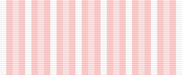
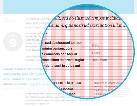
Recently, we’ve been successfully experimenting with a 6px baseline grid coupled with the960px grid system designed by Nathan Smith. This system has three advantages:
- first, it simplifies the design process by removing the “chance” factor (no more questions);
- second, it decreases the time spent at positioning elements;
- third, it increases the feeling of organization in our design by articulating all the graphic elements with type.
Talking about type, we have also chosen to use traditional sizes to go with this baseline (9, 10, 11, 12, 14, 16, 18, 21, 24, 30, 48, 60, 72 points): these sizes prove to be extremely useful when combined with leading derived from 3. For example, body copy can be defined as 14/18 (14pt size and 18pt leading). Small copy can be defined as 9/12. The magic of the grid operates and all these elements suddenly align; same if we choose to create a text block with type set slightly bigger (for example 21/27). Copy aligns itself every six, every four or every nine lines. To paraphrase Robert Bringhurst and his concept of vertical tempo, the baseline helps at adding or removing vertical space to create rhythm.
Now it is easy to align various blocks of text (headings, body copy, etc.) with UI elements such as buttons and textfields as they all sit on the baseline grid. The ultimate purpose of this experimental grid is to facilitate the whole design process, particularly for designers but also to help integrators and developers in their work with CSS and HTML.
We hope that you’ll find this grid useful, not just as another trend to follow, but rather as a holistic strategy to envision and execute simple, clear and balanced design projects.


Recent Comments