Tag Archives: Design

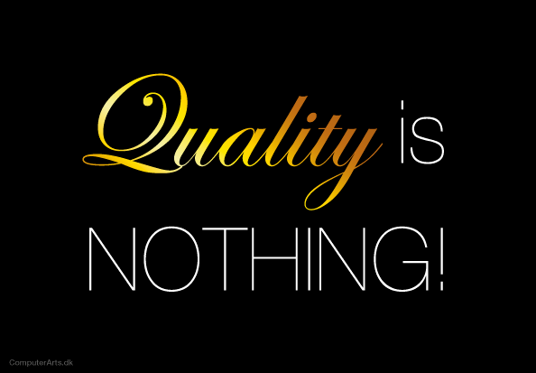
Quality is nothing! How to make your product real quality…

21 Oct

Quality is nothing gold

The cookies were crisp, the coffee was still in the cups and the dark suits had pushed their full stomachs in place under the edge of the conference table , as the director finally broke the silence.

He told us how happy customers were because his company always delivered quality and why we – Mark and I – now would help to communicate it to many more.

Mark took a cookie but quickly put it back and said “I don’t buy quality,”.

The room was silent for a moment – not even the cookies dare to crumble…

Mark explained that he doesn’t believe in thing that just say ‘Quality’. He buys:

  • Things of a particularly hard material. Or silky
  • Things that lasts long
  • Things that still smells of roses after washing number fifty
  • Things that are sustainable
  • Things that are designed by innovative designers
  • Things that he can drop on the floor
  • Things that he will be wiser
  • Things that are user-friendly
  • Things that make him smile

Mark never buy quality because ‘quality’ itself is nothing!

It is an empty word , no telling what awaits us.
Example: Take the cookies from the bowl on the conference table. Are they quality cookies? Why is that…?

  • Because they are made of organic, hand-picked ingredients and no one was hurt during production?
  • Because they do not crumble as much as other cookies?
  • Because they are ultra low on calories?
  • Or because every cookie in the bowl is wrapped in it’s own little delicious hygienic packaging?

We do not know until there is any other word than quality (or professional , dedicated, reliable and efficient) to explain why these cookies are actually better.

Never trust “Quality” until the products explains why

That’s why, like Mark, you should never buy ‘quality’. That’s why you can never deliver just ‘quality’ products to your customers.

You should contribute with something that makes a particular difference to others – and your contribution deserves specific words that captivates people you want to reach. Then they understand and believes that your products are ‘quality’ without you having to print/say ‘quality’ on/about your products.

A tool for finding the right words:

Always ask yourself if the opposite statement could be the case when you put into words what you offer:

Message: “I offer legal services of high quality”
The opposite: “I offer shitty legal services” = FAIL!

Message: “I offer legal services that prevents someone suing you or your company”
The opposite: “I offer legal advice to minimize your losses when you get sued” = It works!

Why are your cookies ‘Quality’?

What quality services or products do you deliver? Type it below if you want feedback 🙂

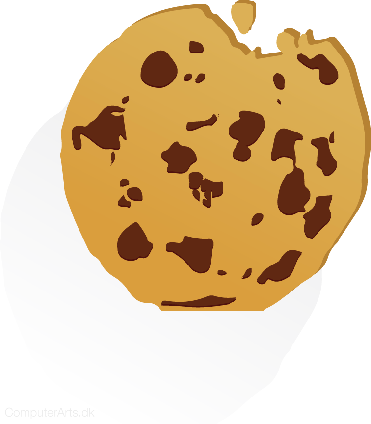
chocolate cookie vector png for sale - designed by computerarts.dk

Thanks to kraes.e-conomic.dk for the idea

7 wacky, interesting and creative works of design

8 Aug

7 wacky, interesting and creative works of design – Sometimes I just want to share interesting stuff – this is one of these times… 🙂

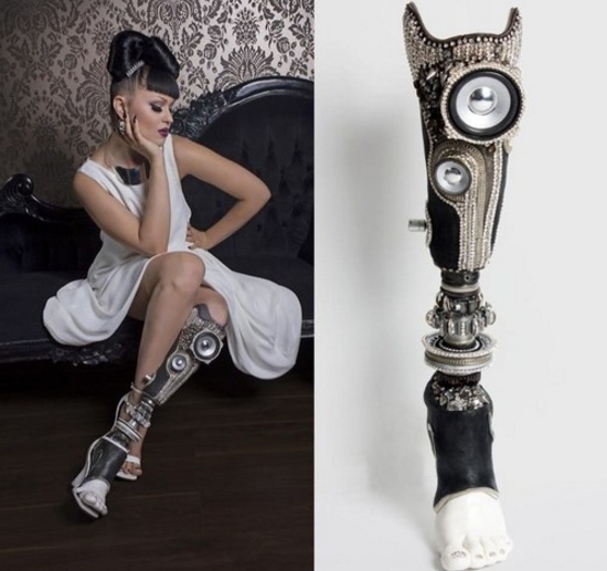
artificial leg with diamonds and pearls with speakers?!

Amazin buddah in mountain

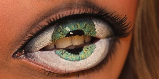
Is it an eye or a mouth? make-up artists gone wild!

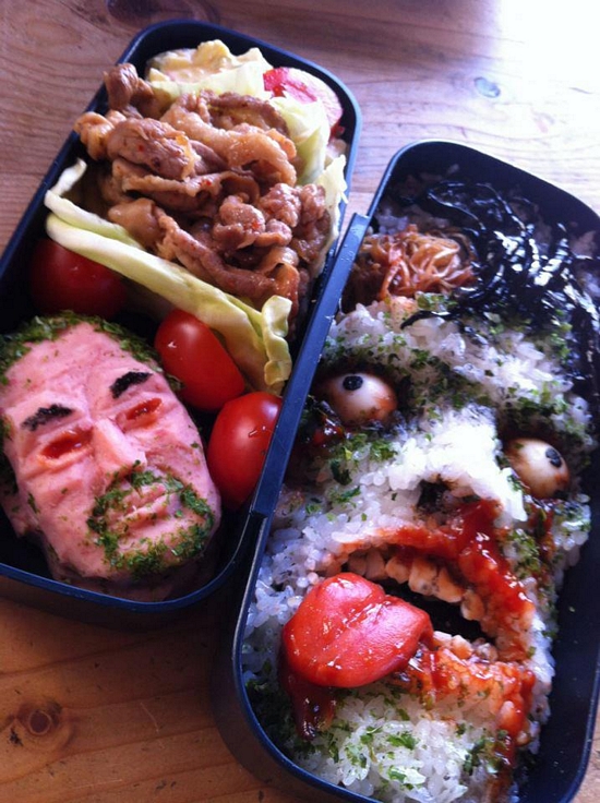
Thats a new way to get your chinese takeaway!!! Zombie food

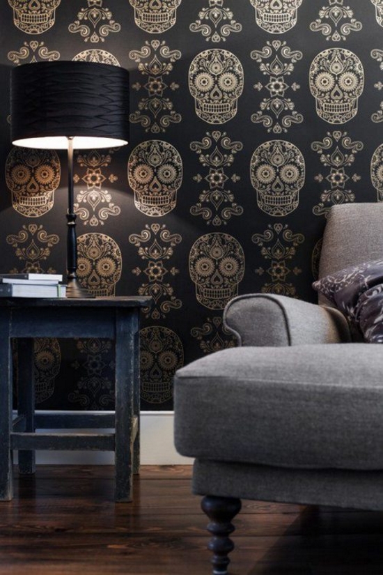
Skull wallpaper with gold… amazingly wierd and cool

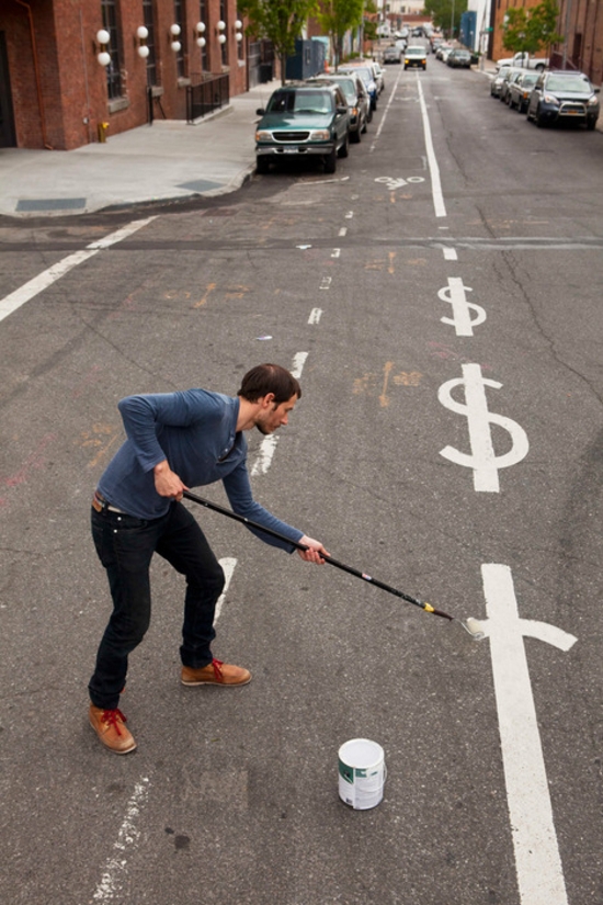
street painter with dollarsigns on his mind and painted on roads now…

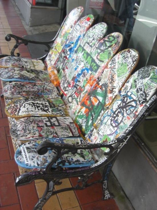
Skateboard bench – take an old bench and some old skateboards and create something new… or dont – but the idea is original and inspiring!

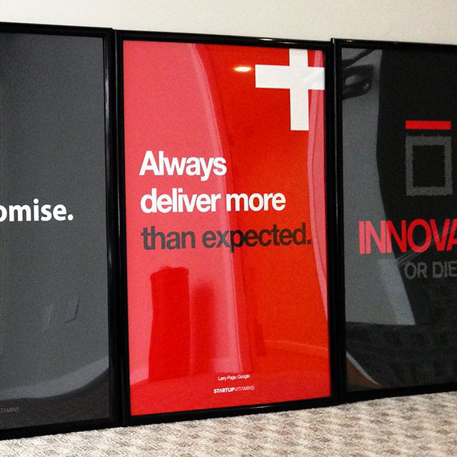
always deliver more than expected poster

Always deliver more than expected poster – that just looks so neat and simple

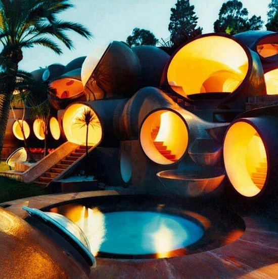
crazy designed hotel tubes

wacky hotel design with tubes and something that just looks like its from a futuristic seventies hotel – amazing! Reminds me of the ball chair!


Old fashioned Signwriting aka Reverse Glass, Gold Leaf Sign Artist

25 Jun

john mayer born and raised

Handcrafts and hard work pays off when you are this good at making designs. This kind of craftsmanship is incredible and I just enjoy how much detail he designs. The process of this kind of artwork is long and worthwhile! I wish I could make things that are this beautiful – but I will stick with Illustrator and Photoshop to give me the results I want. But we should never forget the old ways of doing things – it just puts everything in perspective and inspires. Enjoy the patience he has…

David A Smith is a name that has become synonymous in Sign-Writing and Glass gilding circles, with high quality, hand crafted reverse glass signs and decorative silvered and gilded mirrors.

In this short documentary, we reveal behind the scenes work, techniques and visions that Dave uses when carrying out his passion as a glass embosser – One of the few remaining traditional UK glass artists.

David A Smith
davidadriansmith.com

John Mayers album artwork is designed the old way with Reverse glass design

David A. Smith is a traditional sign-writer/designer specialising in high-quality ornamental hand-crafted reverse glass signs and decorative silvered and gilded mirrors. David recently produced a wonderful turn-of-the-century, trade-card styled album cover for popular American singer/songwriter John Mayer.

This film captures the ‘Behind The Scenes’ creation of the ‘Born & Raised’ and ‘Queen of California’ artwork, as well as 2 unique reverse glass panels, hand-crafted in England by David A. Smith.

Music by John Mayer www.johnmayer.com
A Film by Danny Cooke www.dannycooke.co.uk
Featuring David A. Smith www.davidadriansmith.com

Clever Infographics about Webdesign

7 Jun

As a graphic designer and webdesigner at ComputerArts.dk I was looking for some Clever Infographics about Webdesign. And here are some of my favorites. Enjoy and be inspired…

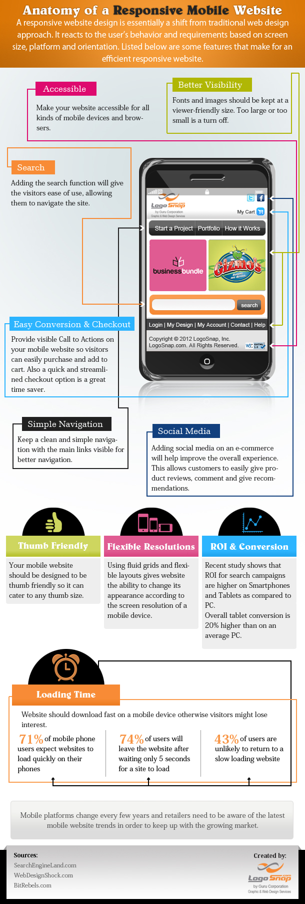
responsive website design what is it

responsive website design what is it

responsive website infographic

responsive website infographic

effective web design

effective web design

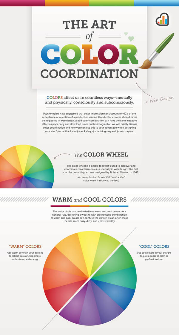
the art of color coordination in web desing infographic des

the art of color coordination in web desing infographic des

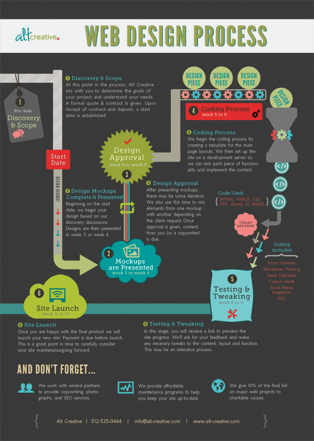
webdesignprocess dark

webdesignprocess dark

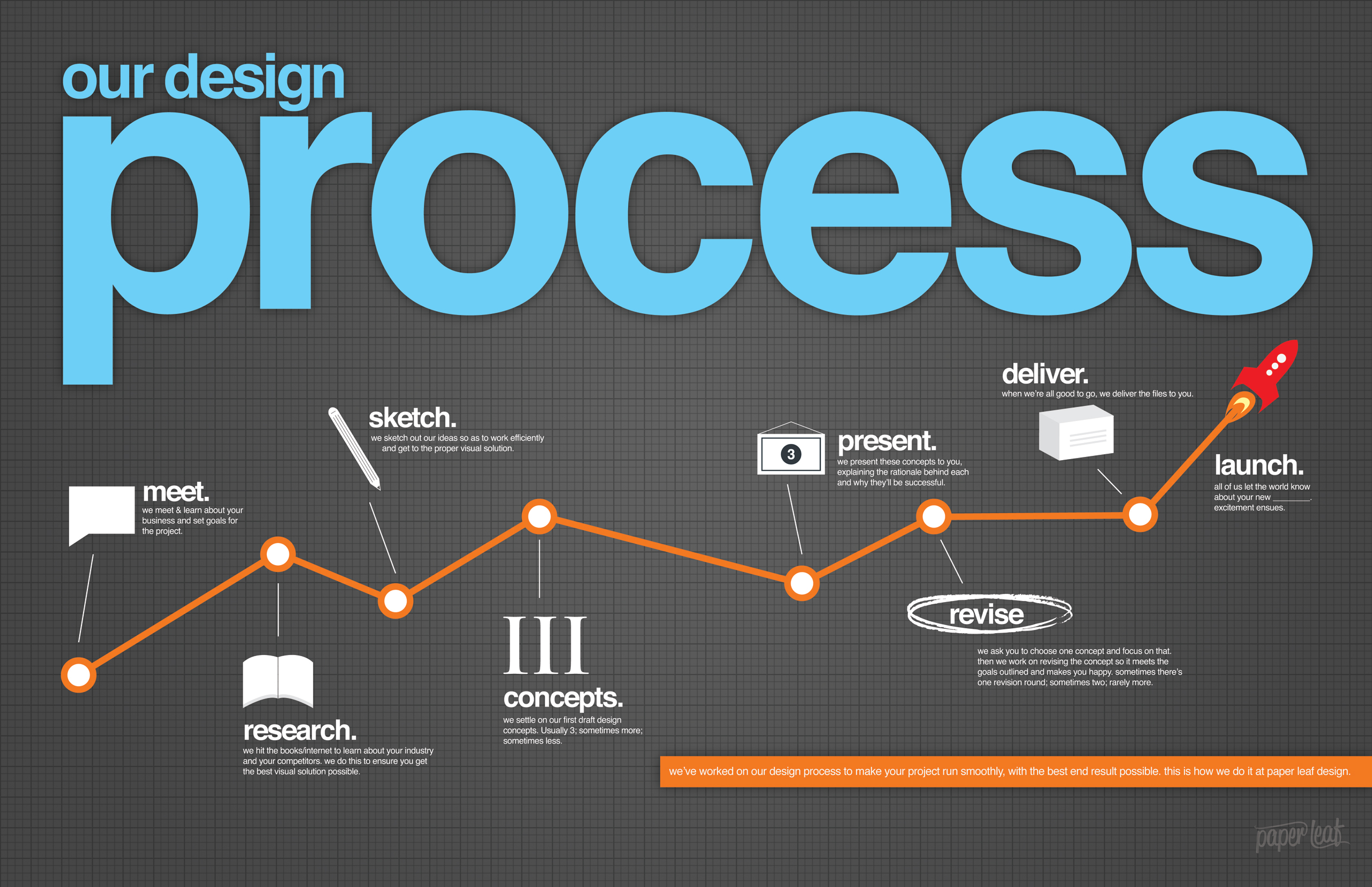
process2560

process2560

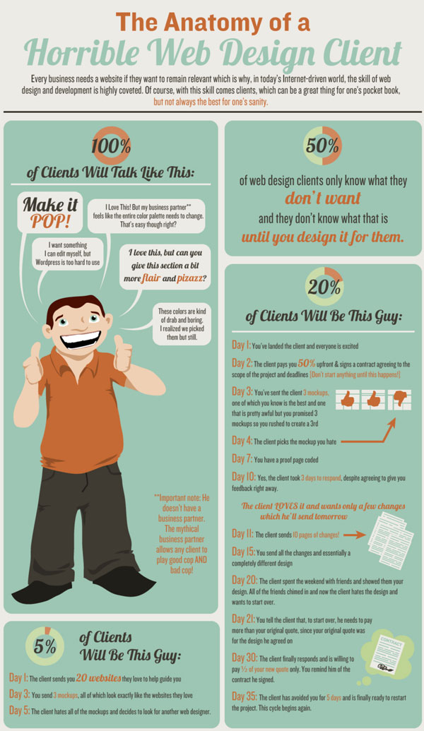
web design 1

web design 1

cool graphic design infographics 12 xl

cool graphic design infographics 12 xl

6razonesparadisenarelwebyellogoalavez

6razonesparadisenarelwebyellogoalavez

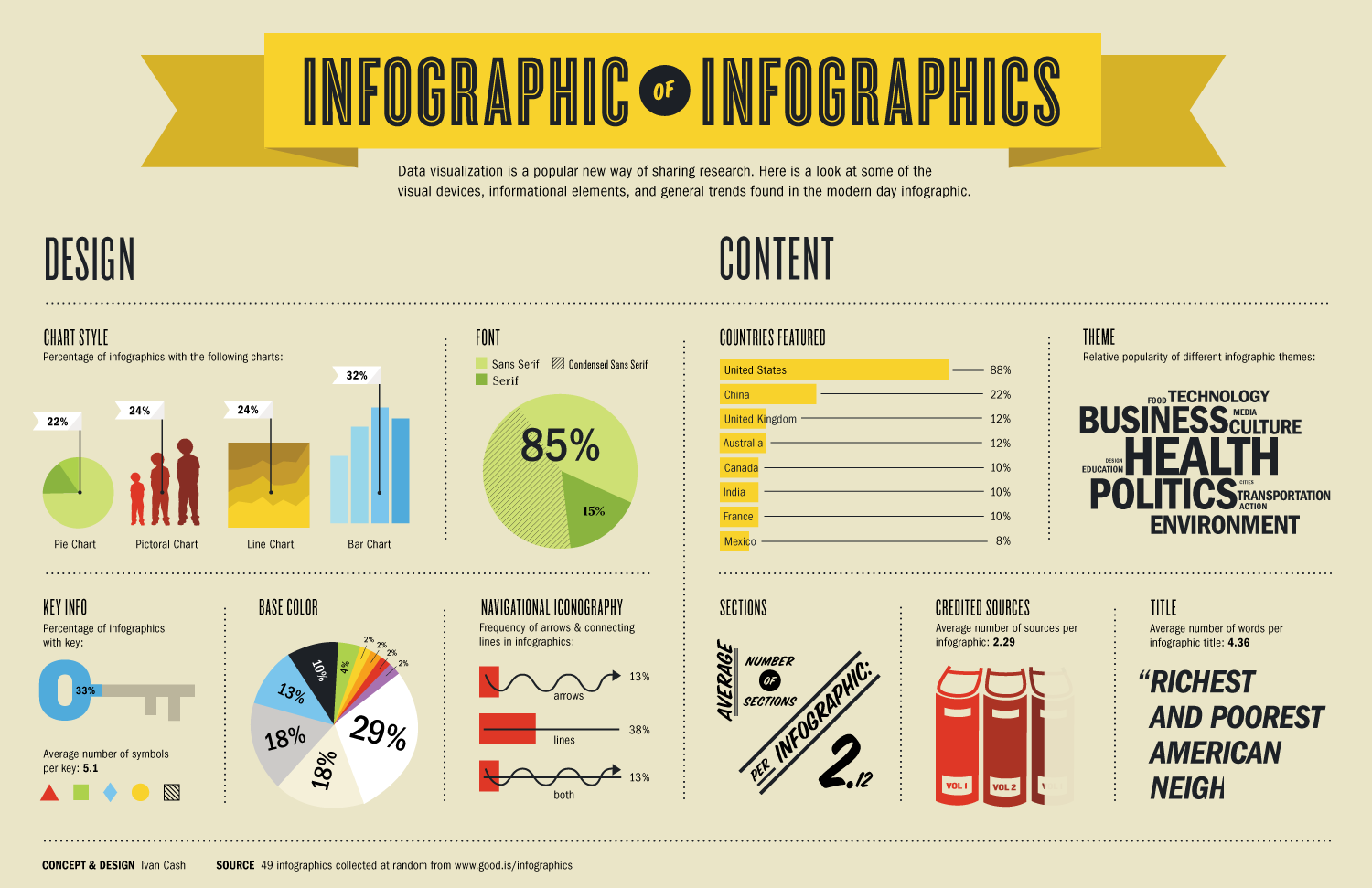
infographic of infographics

infographic of infographics

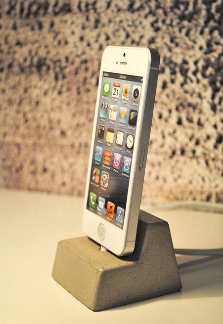
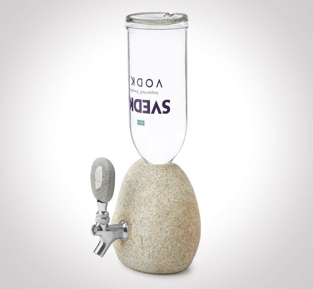
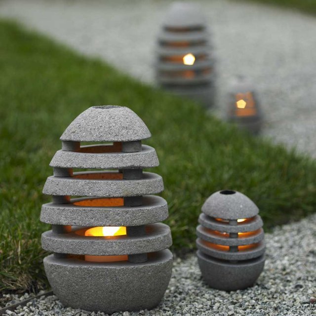
Inspiring concrete designs

16 May

I enjoy Concrete designs. I used to have a giant concrete table that was so heavy that we had to be 6 people to move it! I miss it but here you can get inspired:

concrete iphone dock concrete bottle concrete office tools concrete garden lights concrete bathroom

source: http://www.thefancy.com